Flying with Bad User Interfaces
/
So today I was lucky enough to get to fly out to Seattle for the MVP Summit. That’s twice in one year. Lovely. We took off and before long I was playing with the in-flight entertainment. As you do. The picture quality and sound were excellent. The range of movies and TV shows as wide. But the user interface was horrible.
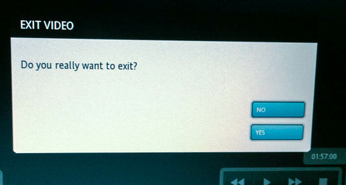
Take the screen above. The user interface is touch driven, so you are reaching out with your fat fingers on the end of your wobbly arm to hit one of the two buttons, which do fairly critical things. Get the wrong button and you will be upset. So why are the buttons so close together, so small, and why is the text on them so hard to read?
And then there’s this:
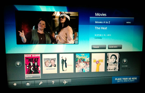
This is how you pick the films. The screen is pretty enough but it is filled up with useless information. The titles of the films themselves are impossible to discern on the artwork and the scroll targets are tiny tiny. If they had thought about it they could have put the name of every film, in text, on one screen and saved us the hassle of grinding through the pages.
Add to this a very unresponsive and inaccurate input and you have a recipe for an unhappy user. And the annoying thing for me is that the service, once you started watching, was very good indeed. It was just that someone really didn’t think how the user interface was supposed to work.